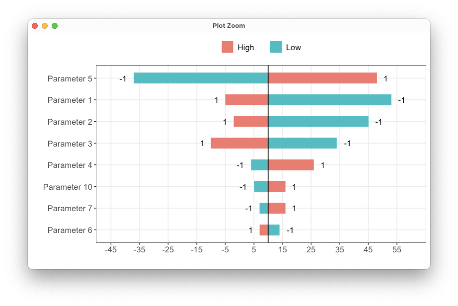
tornado plot in ggplot2
Sharing some general purpose code for making tornado plots in ggplot2.
This uses a hack where the outcomes are transformed into deviations from the base case outcome, plotted using geom_bar, and the axis is manually relabelled.
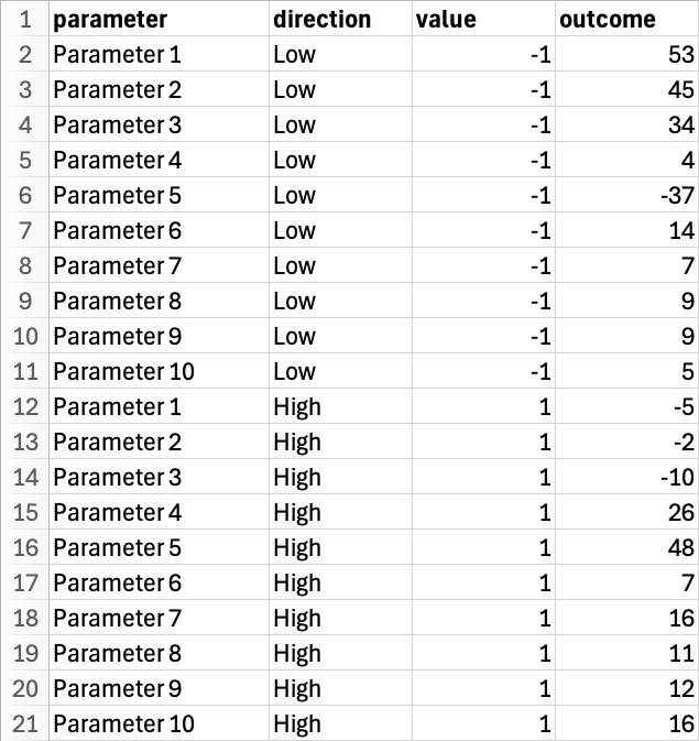
First, save the data in this format:
Here is the code:
library(tidyverse)
library(dplyr)
library(ggplot2)

# Base case outcome
outcome.base <- 10

# Order by the difference between the High and Low value
df <- read.csv('DSA.csv') %>%
  group_by(parameter) %>%
  mutate(diff = sum(abs(outcome - outcome.base))) %>%
  arrange(diff, parameter, direction)

# Keep the top 8 parameters
df <- tail(df, 8 * 2)

# Enforce the ordering in the plot
df <- df %>%
  mutate(parameter = factor(parameter, levels = unique(df$parameter)))

# Inspect the minimum and maximum values
min(df$outcome) # -37
max(df$outcome) # 53

# Choose axis labels/breaks/limits based on the range of values
labels <- seq(-45, 60, by = 10)
breaks <- labels - outcome.base
limits <- c(-45, 60) - outcome.base

ggplot(df, aes(x = parameter, y = outcome - outcome.base, fill = direction)) +
  coord_flip() +
  geom_bar(stat = 'identity', position = 'identity', width = 0.5) +
  geom_hline(yintercept = 0) +
  scale_y_continuous(breaks = breaks, labels = labels, limits = limits) +
  geom_text(data = df %>% filter(direction == 'Low', outcome < outcome.base),
            aes(label = value), vjust = 0.5, hjust = 2) +
  geom_text(data = df %>% filter(direction == 'Low', outcome > outcome.base),
            aes(label = value), vjust = 0.5, hjust = -1) +
  geom_text(data = df %>% filter(direction == 'High', outcome < outcome.base),
            aes(label = value), vjust = 0.5, hjust = 2.5) +
  geom_text(data = df %>% filter(direction == 'High', outcome > outcome.base),
            aes(label = value), vjust = 0.5, hjust = -1.5) +
  xlab('') +
  ylab('') +
  theme_bw() +
  theme(panel.grid.minor = element_blank(),
        text = element_text(size = 14),
        legend.position = 'top',
        legend.title = element_blank(),
        legend.key.spacing.x = unit(0.75, 'cm'))
Here is the result: